文章内容
2016/12/21 16:32:48,作 者: 黄兵
CSS盒模型宽度理解
内盒尺寸计算(元素大小):
element高度=内容高度+内距+边距(height为内容高度)
element宽度=内容宽度+内距+边框(width为内容宽度)
下面看实例:
<!DOCTYPE html>
<html lang="en">
<head>
    <meta charset="UTF-8">
    <title>页面布局</title>
    <link href="css/Add-Style.css" rel="stylesheet">
</head>
<body>
<div class="wrapper">
    <div id="header">页眉</div>
    <div class="sidebar">侧边栏</div>
    <div class="content">主内容</div>
    <div id="footer">页脚</div>
</div>
</body>
</html>
样式代码:
*{
    margin: 0;
    padding: 0;
}
.wrapper{
    width: 960px;
    height: auto;
    margin: 0 auto;
    display: block;
    color: #fff;
    text-align: center;
}
#header{
    width: 100%;
    height: 100px;
    background-color: #99CCCC;
    margin-bottom: 10px;
    padding: 10px;
}
.sidebar{
    width: 220px;
    margin-right: 20px;
    height: 200px;
    background-color: #FFCC99;
    float: left;
    margin-bottom: 10px;
    padding: 10px;
}
.content{
    width: 720px;
    height: 200px;
    background-color: #FFCC99;
    float: left;
    margin-bottom: 10px;
    padding: 10px;
}
#footer{
    width: 100%;
    height: 100px;
    background: #FFCCCC;
    clear: both;
    padding: 10px;
}
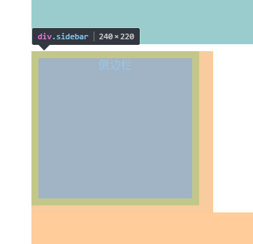
元素宽度=220px+10px*2+0px,
其中220px为内容宽度;
边框没定义为0px。
高度同样是这个公式。
上面的是W3C的标准盒模型计算公式。
评论列表